Case / 03
Suggested Routes
Designing faster, more confident route decisions in a real-time transit environment
Company
Moovit
Year
2023
Environment
Mobile (iOS And Android)
Type
Redesign
Role
Design Lead
Hands-on
The Conceptual Part
Team
1 Designer · 1 PM · 2 Dev. Teams
Challenge
Choosing a route under pressure
Suggested Routes sits at the heart of Moovit's experience, helping users compare travel options and choose a route after searching for a destination.
Users may already be moving, short on time, or navigating an unfamiliar place. They must weigh transport types, journey duration, arrival time, transfers, walking distance, price, and service conditions.
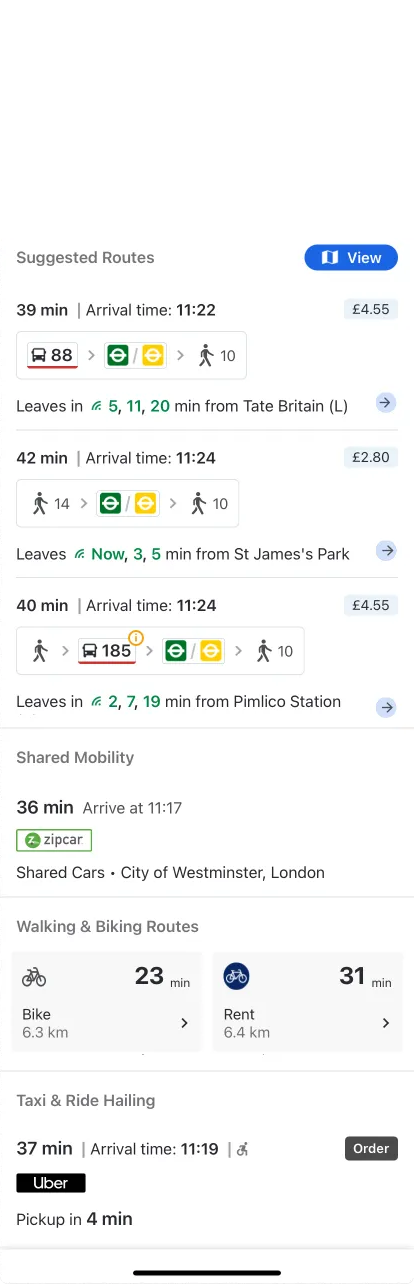
The existing screen showed this information but wasn’t structured to support comparison.
Individual routes were understandable, but comparing them took effort. Details weren’t aligned across the list, weak separation blurred which information belonged together, and primary and secondary details carried similar visual weight.
Under pressure, users often focused on arrival time or accepted the first suggestion instead of weighing the alternatives.
Insight
From complete information to comparable information
Users did not struggle with too many options, but with seeing the differences between them.
The layout presented each route as a self-contained block, asking users to examine options one by one. Yet route selection is inherently comparative: an option’s value becomes clear in relation to the others.
Suggested Routes needed the clarity of individual route blocks and the easy comparison of a table.
Surveys, behavioral data, and usability testing showed that users prioritized journey duration and estimated arrival time. Whichever came first, the other was almost always second. Transit type, transfers, walking, and price followed.
A guiding principle
In decision-heavy experiences, usability depends less on how much information is available and more on how clearly the system structures comparison.
Design Solution

Aligned columns and a clear duration anchor make comparison the primary reading mode.
A route list designed for comparison
We redesigned the route cell as a hybrid: the comparability of a table with the clarity of a card.
Establish a comparison anchor
Journey duration became the strongest visual element, consistently positioned beside estimated arrival—the user's second priority. This gave users a stable reference for scanning routes and spotting the fastest option.
Follow the user's decision order
The hierarchy follows how users evaluate routes: duration → arrival time → transportation type and route structure → transfers and walking → price. Distinct visual weights help users narrow their options before exploring details.
Align information across routes
Consistent positions, logical grouping, and clearer separation let users compare vertically without rereading each cell or confusing details between routes.
The experience shifted from examining routes one by one to comparing them as a set.
Impact
From faster decisions to stronger retention
The redesign improved behavior at the exact point where users decide whether they trust the app's recommendation enough to continue their journey.
At the interaction level, users
- Compared and selected routes faster.
- Moved back and forth between alternatives less frequently.
- Relied less on opening multiple routes before choosing.
- Made decisions with greater confidence under time pressure.
- Understood the differences between routes more easily.
Beyond usability
A/B testing showed approximately a 1.9% increase in Day 1 and Day 2 retention and a 1.2% increase in 30-day retention. Improving an early, high-value decision helped users experience the product as clearer and more dependable.
The redesign also produced an unexpected behavioral signal: taps on the Pay action increased. Payment had not been a target, but clearer comparison made users more willing to act on the choice they had made. Once users understood the alternatives and felt confident in their selection, they were more prepared to continue directly into the journey.
Better comparison → Faster decisions → Greater confidence → Increased action
Reflection
Designing the decision, not just the options
A results screen can include every necessary detail and still fail to help users choose. Completeness is not the same as decision support.
Users establish a reference, narrow their options, and inspect the trade-offs that matter. The interface should support that sequence rather than give every detail equal emphasis.
A broader principle
When users compare alternatives, make the differences visible before asking them to explore each option in depth.
This extends beyond transportation to shopping, financial products, observability tools, and AI recommendations.
More information does not necessarily lead to better decisions—it can make choosing harder. Design’s role is to structure that information so people can decide with confidence.