Case / 04
Itinerary
Transforming fragmented information into a continuous visual story
Company
Moovit
Year
2023
Environment
Mobile (iOS And Android)
Type
Redesign
Role
Design Lead
Hands-on
No
Team
1 Designer · 1 PM · 2 Dev. Teams
Context
More than a list of directions
The Itinerary is one of the most important screens in any public-transit app. It explains how to reach a destination by connecting walking instructions, stations, transit lines, transfers, and arrival times into a single journey.
But people use this information in different ways.
New or occasional riders may need detailed, step-by-step guidance. More experienced riders often want to scan the route, identify its main stages, and understand the journey at a glance.
The Itinerary therefore had to work simultaneously as guidance, overview, and reassurance—turning complex transportation data into a story users could understand quickly and follow confidently.
Challenge
A detailed story that was difficult to scan
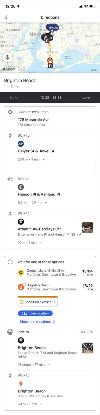
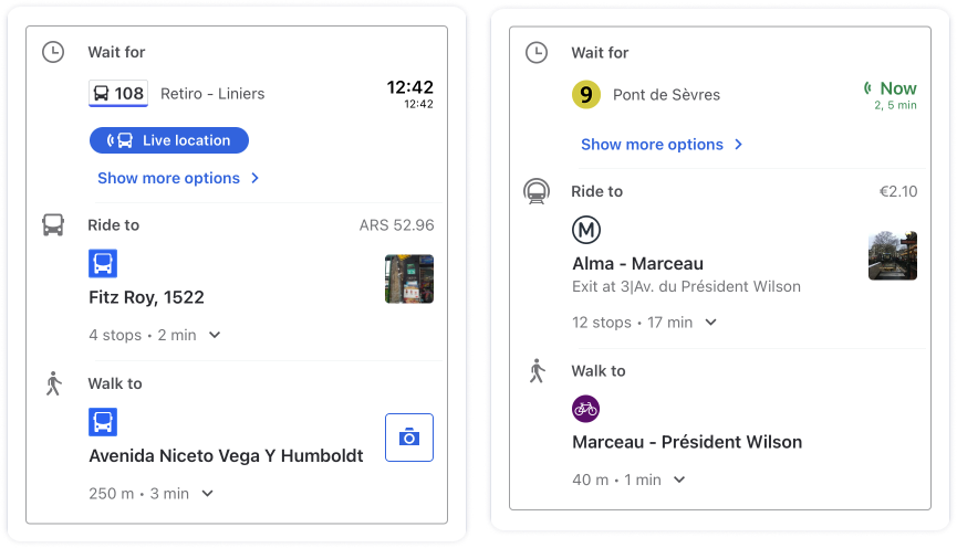
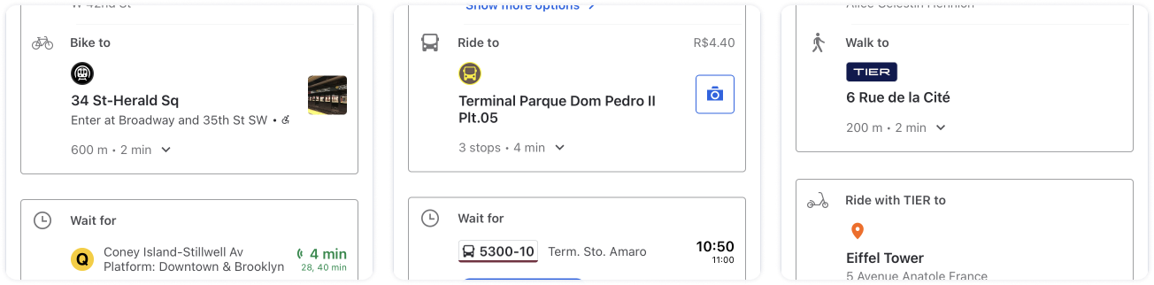
Moovit's existing Itinerary explained the journey through separate cards for walking, waiting, riding, and transferring. The cards created visual separation but fragmented the journey.
Related details often appeared in different cards—a transit line in one, its departure station in another—forcing users to mentally reconnect them.
The structure created several problems
- The journey was difficult to scan as a whole.
- Related information was split across cards.
- Equal visual weight made key ride legs, locations, and times harder to spot.
The screen explained every step but lacked a clear overview of the journey.
Insight
The journey should define the structure
The breakthrough was recognizing that an itinerary should not be organized around interface containers.
Users understand a journey as a continuous sequence:
- Start → Walk → Ride → Transfer → Arrive
A linear timeline aligned more naturally with this mental model than a series of independent cards. It allowed users to follow the route from beginning to end without reconstructing connections between separate pieces.
But continuity alone was not enough. A story also needs a visual hierarchy.
In this story, the ride leg is the hero. It is the part users primarily need to recognize: which line to take, where to board it, where it goes, and when it arrives.
The new design needed to combine two qualities
- The continuity of a timeline.
- The clarity and separation of cards.
This reframed the project from redesigning individual route components to designing a coherent visual narrative.
Design Solution

A continuous journey built around the ride
We replaced the fragmented card structure with a linear timeline that presented the itinerary as one continuous journey.
Walking, waiting, riding, transferring, and arriving remained visually distinct through spacing, dividers, backgrounds, typography, and color—but no longer felt like disconnected pieces. Users could follow the route from beginning to end while preserving the relationship between each step.
Within this continuous structure, the ride leg became the primary visual anchor. Transit lines, major locations, and essential times received stronger prominence, allowing users to identify the journey's main stages before reading the supporting details.
This hierarchy enabled the screen to support two ways of reading:
- Experienced or time-sensitive users could quickly scan the route.
- Users needing more guidance could follow each step in detail.
Because public-transit journeys can contain many combinations of walking, rides, transfers, waiting periods, and mobility services, the itinerary was designed as a modular system. Each element functioned like a Lego piece: independently defined but governed by shared rules for hierarchy, spacing, connection, and behavior.
These modules could be assembled into different route configurations while maintaining a coherent visual story. The solution therefore became more than a redesigned screen—it established a scalable language for representing journeys across the product.
Reflection
Design the mental model, not the container
The previous Itinerary was organized around cards. The redesigned Itinerary was organized around the journey.
That distinction changed the experience.
Cards were not inherently the problem. The problem was allowing the interface's containers to determine how users had to understand the information.
A strong information architecture begins with the user's mental model and then selects the components needed to express it.
For an itinerary, continuity communicates meaning. Visual hierarchy creates focus. Modularity supports scale.
Together, these principles turned a collection of transit instructions into a story users could scan, understand, and trust.