Case / 06
Experiments
Making complex A/B tests easier to create, monitor, and act on
Company
Skai (Formerly: Kenshoo)
Year
2020
Environment
Web SaaS
Type
Zero-To-One
Role
Design Lead
Hands-on
The Monitoring Experience
Team
2 Designers · 1 PM · 2 Dev. Teams
Context
Turning experimentation into a decision-making capability.
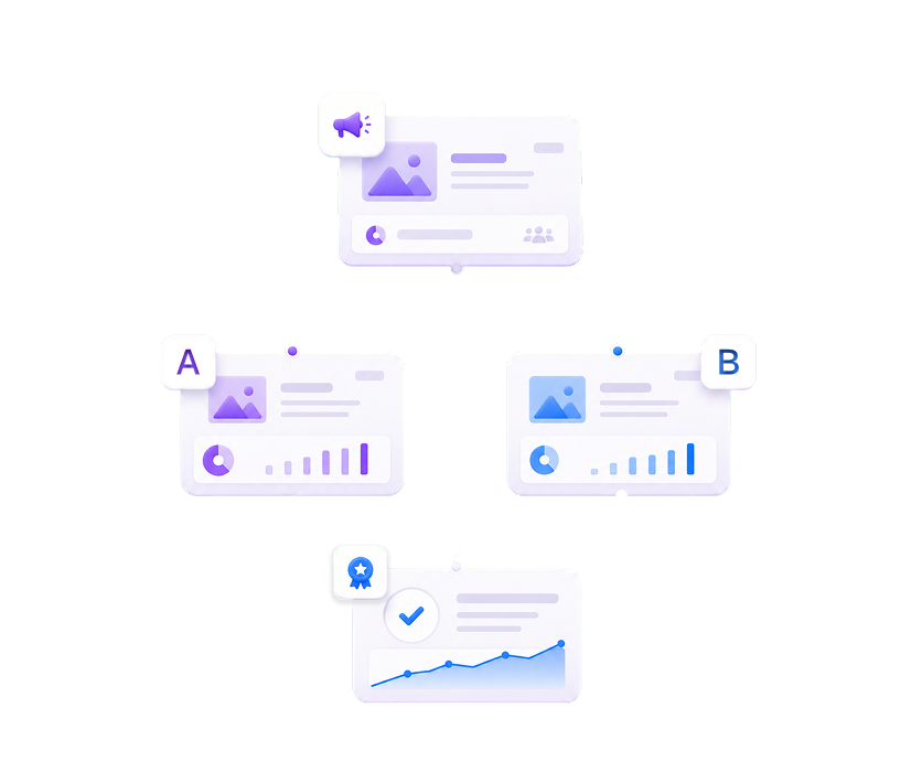
Experiments are A/B tests that let advertisers evaluate campaign changes—such as audiences, targeting, or geography—on a limited group before applying them at scale.
Skai's ambition went beyond matching Google Ads and Facebook Ads Manager. The module aimed to add a decision-making layer above its campaign activation platform.
Designed for expert advertisers managing complex campaigns and extensive performance data, the experience needed to do more than identify a winning variation. It had to support the full decision journey: creating a valid experiment, tracking progress, comparing test groups, and deciding how to act on the results.
Challenge
Expert users had the data, but not the clarity needed to make a decision.
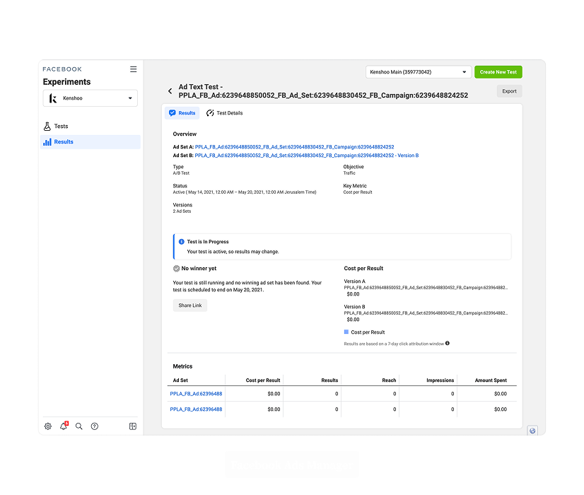
Competitor analysis and client interviews revealed two connected problems: monitoring was too shallow, while setup was too complex.
Google Ads and Facebook Ads Manager offered general experiment overviews but lacked the depth expert users needed to evaluate performance confidently. Users needed to compare test groups over time and across metrics, spot meaningful changes, and investigate beyond the headline result—with clear visuals to support that analysis.
Creating an experiment also required interconnected decisions, from defining its purpose to configuring campaign entities and parameters.
Insight
An experiment is not a configuration followed by a result—it is a decision process unfolding over time.
The research revealed that the module's central purpose was not test creation or data presentation. Its purpose was to help users make a confident campaign decision.
That decision develops gradually. Users begin with a hypothesis, define how it should be tested, monitor the experiment while it is active, compare the behavior of its groups, and finally decide whether the tested change should be adopted.
For expert users, simplicity did not mean removing data. It meant organizing complexity so that the right information appeared at the right point in the decision process.
The interface therefore needed to remain visually quiet while making dense information easy to scan, compare, and understand. Data would be the primary content; the surrounding interface would act as a low-impact facilitator.
Design Solution
Home screen: A scannable experiment overview
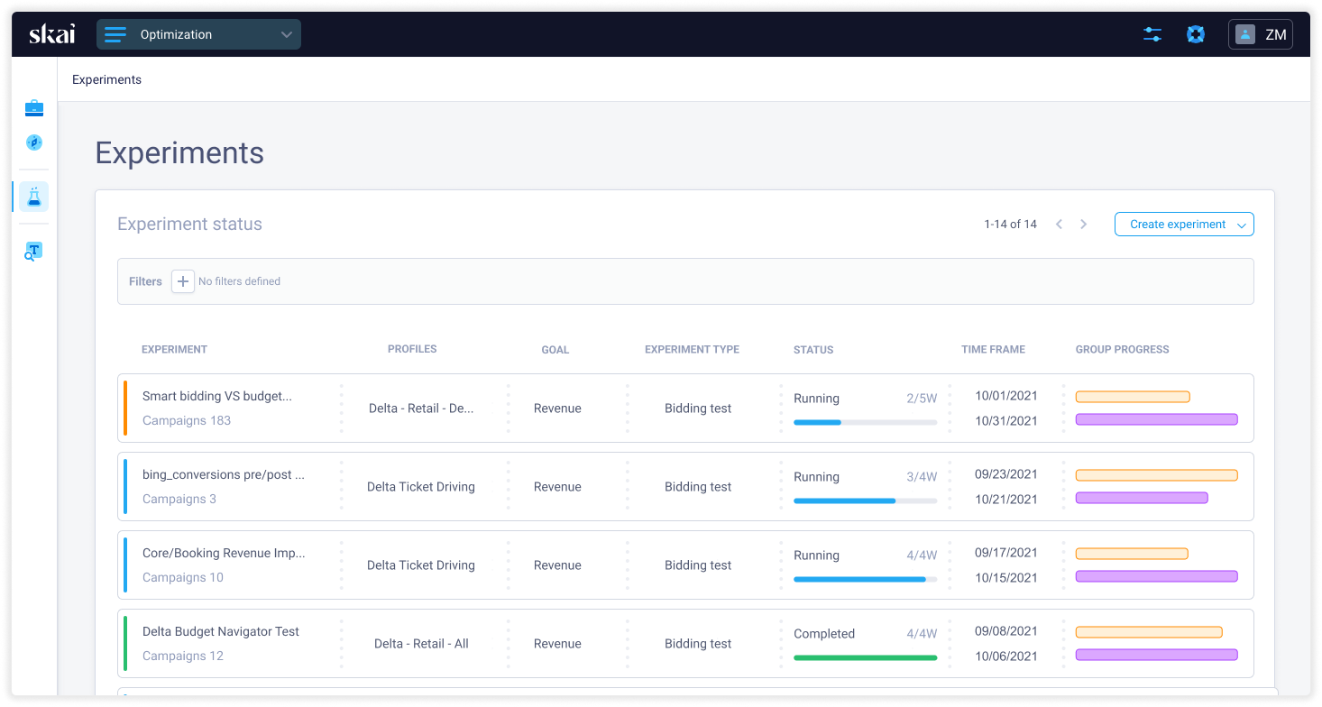
The module's home screen needed to help users understand the state of multiple experiments quickly.
Each experiment exposed three essential dimensions:
- General information about the test.
- Its current stage.
- Its overall result.
The initial direction used a card-based layout. Direct comparison between experiments was not the primary use case, making a traditional table less suitable. Cards also offered an opportunity to introduce a new layout rather than repeat the data grids used extensively across Skai.
Development constraints made maintaining a new, complex component difficult. We also recognized that filtering and sorting were essential for managing a large number of experiments. These considerations led us back to the existing data-grid component—but with a new visual treatment. Generous spacing, reduced visual weight, and clearer separation softened the grid, making it feel more like a structured list while preserving its functional strengths.
Monitoring designed for evaluation
The monitoring screen became the module's main point of differentiation.
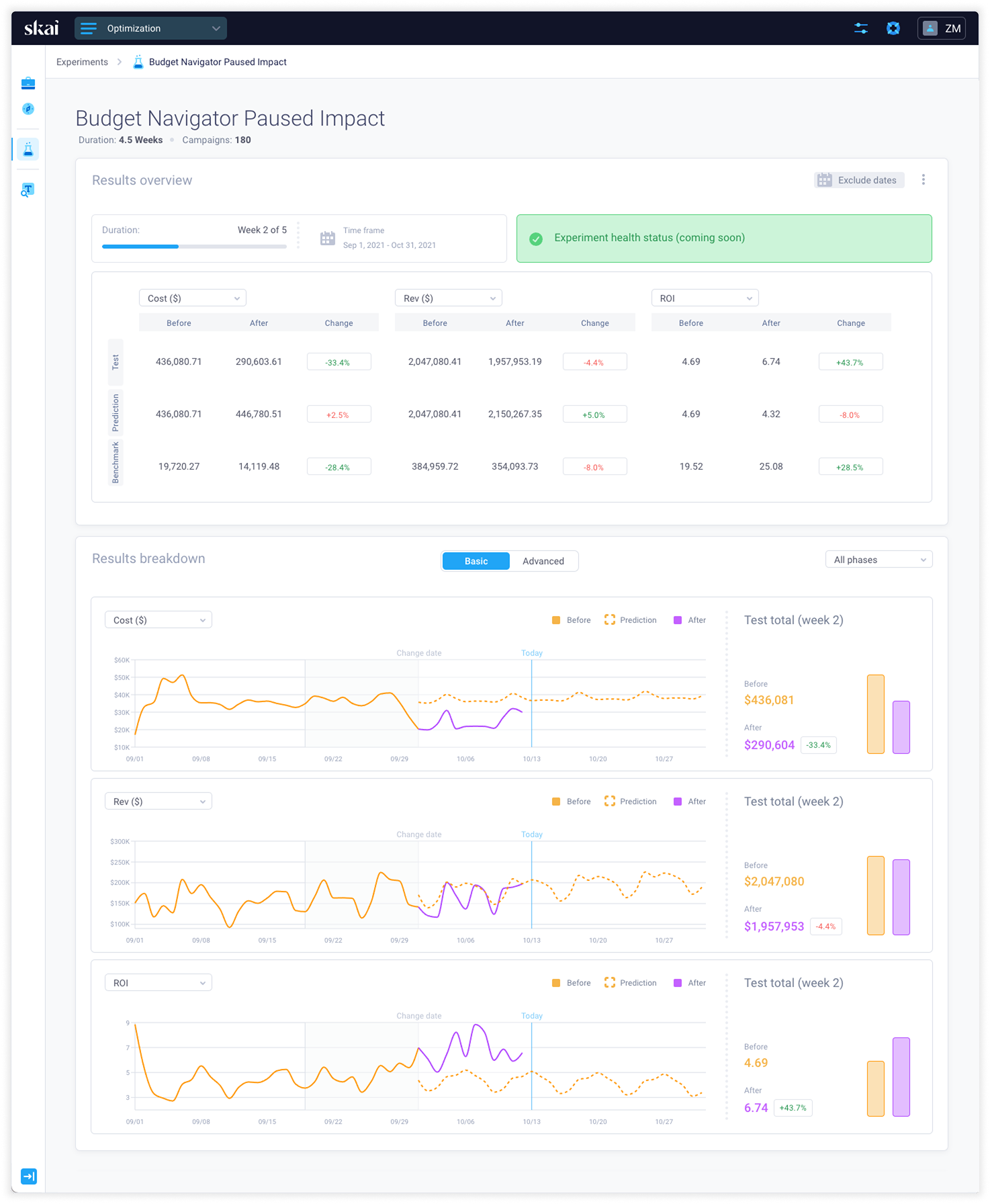
Instead of presenting only an experiment summary, it exposed the metrics expert users needed to evaluate both test groups. Users could compare group performance, examine changes over time, and move from a general result into more detailed evidence.
Charts and visual indicators translated dense performance data into recognizable patterns. This allowed users to understand direction, difference, and progression without relying solely on numerical values.
The result cards combined total values with their corresponding charts. Rather than positioning totals above the visualization—as conventionally done—I placed them directly within the chart area. This made it easier to compare multiple cards in one view and reduced the distance between a metric and its visual behavior.
Less frequently used metrics were moved into an Advanced tab. This preserved access to the depth expert users expected while keeping the default monitoring experience focused and readable.
The approach did not reduce the amount of information available. It introduced hierarchy, separating the information required for an initial evaluation from the information needed for deeper investigation.
Separating tactical and technical decisions
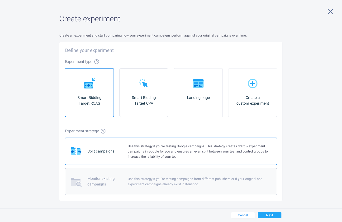
Mapping the complete creation flow revealed that two early decisions determined which configuration path the user would need later.
These decisions were tactical: they established the type and purpose of the experiment. The remaining decisions were more technical and depended on those initial selections.
We therefore separated the creation process into two stages.
The first stage collected the defining choices and allowed the system to generate the relevant configuration flow. The second stage presented only the technical inputs required for that experiment type.
This reduced unnecessary complexity and prevented users from having to interpret options that were irrelevant to their chosen path.
Selections from the previous stage remained visible at the top of the form. This supported recognition rather than recall, helping users understand the current configuration without remembering information from an earlier step.
Making progress visible over time
An experiment is a continuous process, not a one-time action. After setup, it moves through several stages before producing a result.
We introduced a timeline that explained this progression and made the experiment's current position visible. By showing what had happened, what was happening, and what would happen next, the timeline reduced uncertainty and strengthened users' sense of control.
Where numerical or technical information was difficult to interpret, we translated it into natural language. This made the meaning of the configuration more accessible without removing the underlying data expert users depended on.
Across the module, generous whitespace, restrained interface elements, clear typography, and selective color allowed the data to remain prominent. The interface became quieter as the information became richer.
Impact
A differentiated experimentation experience built around informed action.
The new module extended experimentation beyond the basic capabilities available in publisher platforms.
The available source material does not include quantified post-launch results. The clearest measures of success for the experience are therefore:
- Whether users can create experiments with less uncertainty.
- Whether they can understand the relationship between their initial choices and the generated configuration.
- Whether they can compare test groups without assembling information manually.
- Whether the monitoring experience helps them reach a decision faster.
- Whether users feel more confident applying—or rejecting—the tested campaign change.
The project also reinforced a broader direction for Skai's product design:
Expert tools do not become simpler by hiding their complexity indiscriminately. They become simpler when information is structured according to the decisions users need to make.
Testimonials
“Loved the UI, the ease of use, and very useful to track performance on their custom metrics.”

“The ease of use and visual presentation of this tool makes running experiments significantly less laborious [than competitors] to set up and monitor, and the tool makes it easier and faster to report results, with more accuracy.”

“So much easier to view tests in kenshoo [than competitors] within the experiments tab and its super simple to set up.”
